Welcome to my curated list of eclectic projects!
While I've worked on a tremendous amount of varied campaigns over the years, either as a Developer or overseeing as a Lead / Director, these are a handful of the projects that I was involved in the actual coding of and felt a distinct affinity for. Some for obvious reasons, some because of particularly delightful behind-the-scenes workings.
As an aside, I would love for you to keep in mind that this is currently a work in progress.
Click the thumbnails and enjoy!
What's In A Vape
Agency: Wirewax + FCB New York
Client: U.S. Food and Drug Administration
Roles: Creative Tech Director + Front End Developer
While at Wirewax, FCB came to us to create an interactive experience for the FDA to help them spread the facts and dangers of vaping. I helped with the initial brainstorming and then headed up the project, wrangling in multiple external and internal teams, to bring it to its award winning fruition. The idea was to create a highly interactive atmosphere that a user would have to search around to find clues to complete the overall message. I wound up doing roughly 90% of the coding myself, as well as directing the flow of the project and vendors. It was such a hit with the FDA, and showed such incredible retention time, metrics, and positive press, that we were asked to continue to work on it, updating it over time with even more interactivity.
Explore Color
Agency: Wirewax
Client: Home Depot
Roles: Creative Tech Director / Front End Developer
This was quite a treat to work on, again as both Creative Tech Director and Lead Dev. Home Depot wanted a flashy new way to get people more interested in their paint lines and wanted a way to bring site engagement up. It was a challenge at first to come up with something to make a seemingly mundane department more entertaining, but utilizing the idea of a shoppable video, with many more bells and whistles, seemed like the best approach. The video itself was filmed for this experience with longevity in mind: eventually if the project did well enough, there was talk about making everything in the video clickable, so everything you see (not just the paint on the walls) are items that can be found at Home Depot. The codebase needed to be able to handle this request in the future, as well as the initial ask. THD has seen such amazing numbers from this piece, they optioned to have it updated every quarter!
Please note: you may need to scroll down the page a little till you see the interactive video experience!
Meet the 100
Agency: Wirewax + FF Creative Agency
Client: MetLife
Roles: Creative Tech Director / Front End Developer
I had the pleasure of working with, as well as lead and develop from a technical perspective, FF Creative and a number of other vendors by proxy, on this interactive campaign for Metlife. The idea was to try and bring some extra excitement to an Employee Benefits Trend Study they had completed. This was a mind bending foray into making sure that the videos shot blended seamlessly with the interactive nature of the creative, and the mountain of changes both creatively and technically that had to be made a long the way to achieve the final product.
World Food Program Kiosk
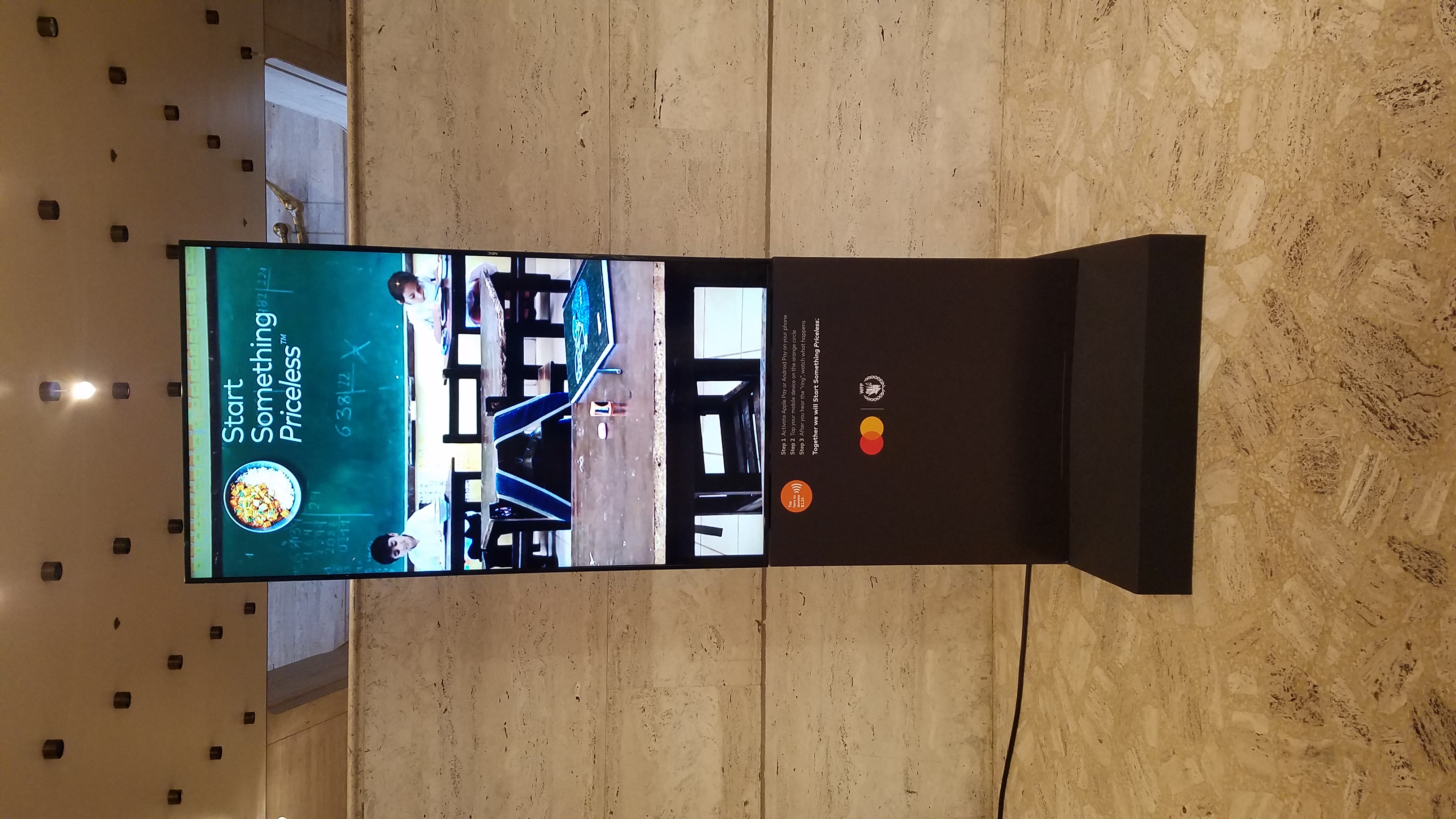
Agency: Craft + McCann
Client: Mastercard
Roles: Senior Developer / Tech Lead / Creative Technologist
One of the more poignant campaigns I've worked on, Mastercard came to McCann looking for a way to help raise money, and awareness, for their World Food Program initiative. The idea manifested as a number of specialized kiosks that would sit in their main branches throughout the U.S. and be brought to different conventions as well. The concept: entice people to donate money, via the kiosk, to help provide lunches to school children in various countries around the world. Users would be shown a looping short video of an empty desk in a classroom with messaging. Once a user tapped their card or their phone to the hidden reader, donating a pre determined amount, it would progress the video to show a student sitting down and enjoying their time in class. This proceeded until the classroom had begun to fill up, then eventually resetting. These kiosks were completely fabricated and developed at Craft. A major first for me in dealing with card readers and payment centers. The hardest part, by far, was figuring out how to communicate with the incredibly archaic hex based API of the card reader and interface it with front end via node. The end result worked wonderfully and I had the pleasure of showcasing it at a handful of events and locations.
Magic Banner Prototype
Agency: Craft + McCann
Client: L'Oreal
Roles: Senior Developer / Tech Lead / Creative Technologist
After a brainstorming session of "pie in the sky" ideas with the CD of the L'Oreal account at McCann, I began creating a specialized "banner" to do something very unique and interactive: allow a user to utilize the content of the page the banner was sitting on to drive sales for a new product line. The idea was to allow people to drag and drop images of people from the page, to the banner, and it would tell you what lipstick from the newest color line best matched that in the photo! To accomplish this, I had to delve into the world of Google Cloud Vision and use node/express to ferry results back and forth. Although it was never picked up (the price tag put forward by Account was exorbitant), I still am incredibly proud of the outcome.
Fun fact: I had no clue that how humans perceive color is rather different from what is mathematically correct. My initial code for detecting the closest color worked, but the results didn't seem right. After a great deal of research, I found an rather lengthy algorithm, that I then modified into javascript, to better pick the closest to what a human perceives!
Please Note: because the backend for this is sitting on a free version of Heroku, you may have to wait a bit for the results, due to it needing to spin up the virtual server.
Defend our Future!
Agency: BBDO
Client: Environmental Defense Fund
Roles: Associate Tech Director / Front End Developer (desktop)
This site became incredibly political, very quickly, and led to very interesting situations within the company. However, because of the nature of the campaign, and the client involved, we were allowed much more creative freedom than most sites. This allowed us to use a wide array of fun techniques of animation, complete with interactive webgl smoke! This was also a first for me: I was working on the desktop site, while someone else worked on the mobile (after I paved the 1st iteration) at the same time, and we would have to merge code constantly and work in tandem. The mobile site, in this particular case, had a lot of different functionality as far as sections being removed, new menus and effects being dumbed down. This proved to be harrowing under many situations while working on the same files.
Kitty Wop
Agency: BBDO
Client: Mountain Dew
Roles: Associate Tech Director / Front End Developer
After Mountain Dew launched an incredibly odd campaign featuring a dancing mangy stuffed cat, an idea was sold to them of a mobile site that allows people to listen to the song from the commercial, while making the same cat dance to it however they wish. Users could also pose the cat with oddball backgrounds and catch sayings to then share on social media. My first foray into a fluid responsive site. This was a great lesson in optimization, as there were so many different images, and image types, that a hand coded smart preloader was needed. I had a little less than 2 weeks to go from start to finish with multiple rounds of review and constant hang ups (such as: how do you make animated gifs go with the beat of a song?). Was a challenge but quite fun!
Bobblehead Shop
Agency: BBDO
Client: ATT
Roles: Associate Tech Director / Front End Developer (desktop)
ATT wanted a custom bobblehead creator that then pieced together your choices into an animated gif that a user could post to various social media outlets. This was a great collaboration between a lot of different people (two backend developers (one in Bulgaria), two 3d designers, three creatives, and 3 front-end devs). My original thinking, that I could just color images dynamically on the fly, wound up not going too well, as the backend piece that constructed the final gif could not accomplish this feat using just color codes. We wound up having each piece created by PAs as .pngs. As they added more and more features, the amount of data being loaded in upfront grew to an appalling 30+ megs, horrifying when thinking about how this had to work on mobile too. Even after optimizing images, I was forced to write a loader that would accommodate this and only load what pieces were needed, when needed, after the initial models. All variables at the end of the experience were then sent off to a script that interfaced with another 3rd party image creator and spit back to the front end when ready with a reference to where it resided, to be used not only to view the image, but also share it. A lot of fun to see it all begin coalescing with great results! The client wound up ordering two more iterations with more options.
Batten & Company
Agency: BBDO
Client: Batten & Company
Roles: Associate Tech Director / Front End Developer
A seemingly simple one page site. This was my first time playing with animation tied to scrolling. I wound up utilizing skrollr.js to help facilitate this. Once again, I ran into file size bloat. Because the client wanted to obtain such a lengthy animation while still keeping it so crisp, the 100s of images comprised in the two animations wound up bringing users machines to their knees when scrolling. I had to rewrite how the images were loaded and how the base nature of the js framework was implemented. Instead of the whole animation being available, it now realizes where you are and only has a finite number of cels available in the DOM. Enough to make sure it’s smooth and still allows for a fast scroll, but also few enough that even much older machines can cope.
Bacardi Limon Go Charge
Agency: Maverick Digital
Client: Bacardi
Roles: Senior Front End Developer
My first contract campaign in NYC! The task: create an engaging interactive front end experience to be shown in a phone charging station that would be distributed throughout NYC's bars all while staying on brand. The challenge: it had to be done in Flash and work well on the proprietary hardware that was already horribly out of date. The outcome was highly entertaining and had interactive drink recipes, Madlibs, trivia, and a number of Easter Eggs (including a hidden live radio station). The joy of actually seeing these eventually out in the wild was something I had never experienced before!
Please Note: you will need flash in order to view the experience.
Banners
Throughout my years of developing for the web, there have always been banner ads. I've done more than I can possibly remember. When the switch from Flash to HTML was forced on agencies, I helped champion a process to create these ads much quicker by creating and utilizing a series of tools to vastly speed up the process and render the outcome into a very simple to understand, and more importantly, simple to pick up and work on format. A banner scaffolding and build tool! While I was at BBDO, I was also involved with Google and IAB to help form new standardizations. To their credit, banners can actually be fun! A lot of interesting tricks can be learned, as well as very useful techniques for optimization and web animation.
If you are at all curious about my past work (predominantly in Flash), I have an archived site that showcases some of my work throughout my career pre NYC. You can see it here: